Case Study
Dogly Product Design
Building a coherent, image-led product language across six years of expert content, community, subscriptions, onboarding, daily guidance, and commerce.
Overview
Over six years at Dogly, I have led much of the product's aesthetic and interaction evolution while also engineering the systems underneath it.
Dogly is not one simple product surface. It combines expert content, community discussion, personalized plans, subscriptions, live groups, ecommerce, partner directories, onboarding, and administrative tools. Each area accumulated its own history, frameworks, and visual conventions.
The design challenge was to make those experiences feel like one product without flattening the emotional quality that users valued most.
Start With What Users Value
In a round of customer feedback, users repeatedly told us that they loved Dogly's imagery.
That mattered because images were also one of the site's largest performance costs. The simplest optimization would have been to remove them, reduce them aggressively, or replace them with a more minimal interface.
I did not think that would improve the product.
A small performance improvement may be imperceptible to most people. Removing the images that made the experience feel warm, credible, and inspiring would be immediately visible. The requirement was therefore not "use fewer images." It was "preserve the emotional value of imagery while controlling its cost and keeping text usable."
That principle shaped the visual system that followed.
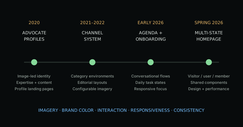
Establishing a Visual Language
I retained the green from Dogly's logo as a selective, consistent brand color. It could communicate trust, continuity, progress, and positive state without saturating every screen.
I introduced orange as the primary interaction color for calls to action, links, frontend actions, and meaningful state changes. This created a clearer distinction between the brand's visual identity and the places where a person could do something.
Imagery also gained a method rather than being selected page by page:
- Grass and dogs in grass for training.
- Concrete and grounded surfaces for nutrition.
- Sky and open atmosphere for wellness.
Those environments were not literal rules for every asset. They gave each content channel a recognizable mood connected to its subject matter.
Layers and overlays protected text contrast when copy sat over photography. Rounded cards, restrained shadows, consistent internal spacing, and repeated content structures helped image-rich pages feel intentional rather than collage-like.
Era One: Advocate Profiles
The Advocate show page was my first major Dogly project in 2020.
It needed to communicate professional credibility, expertise, content, and personality on one landing page. That work introduced patterns for image-led headers, Advocate identity, topic presentation, and content cards that influenced later community surfaces.
The page is now one of the older remaining experiences and is due for another modernization. That makes it a useful bookend: it shows both the beginning of the design direction and how far the surrounding system has evolved.
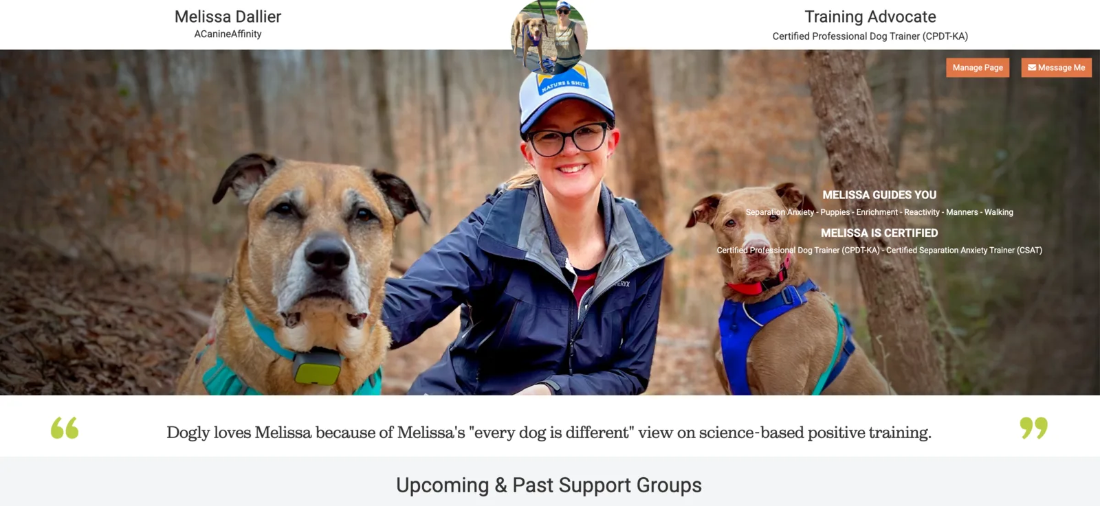
The early Advocate profile established an image-led presentation for professional identity and expertise, but its dense overlay and small controls also show where the system began.
Era Two: Channels
The channel system developed from late 2020 and expanded substantially through 2021 and 2022.
Channels organized training, nutrition, and wellness content around topics users understood. They became the clearest early expression of the environmental image language: category photography, layered headers, editorial content, video, recipes, and agendas organized into a consistent page structure.
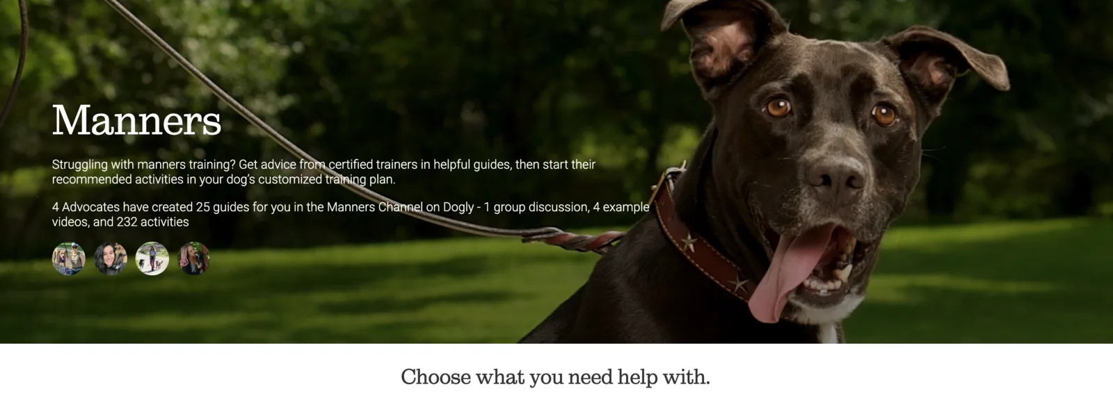
Channels connected subject matter to a distinct visual environment while keeping the people behind the guidance visible.
This era also exposed the cost of inconsistency. Similar cards and controls had been implemented in multiple React and Rails surfaces with slightly different spacing, behavior, and responsive assumptions. The product needed reusable decisions, not another isolated page redesign.
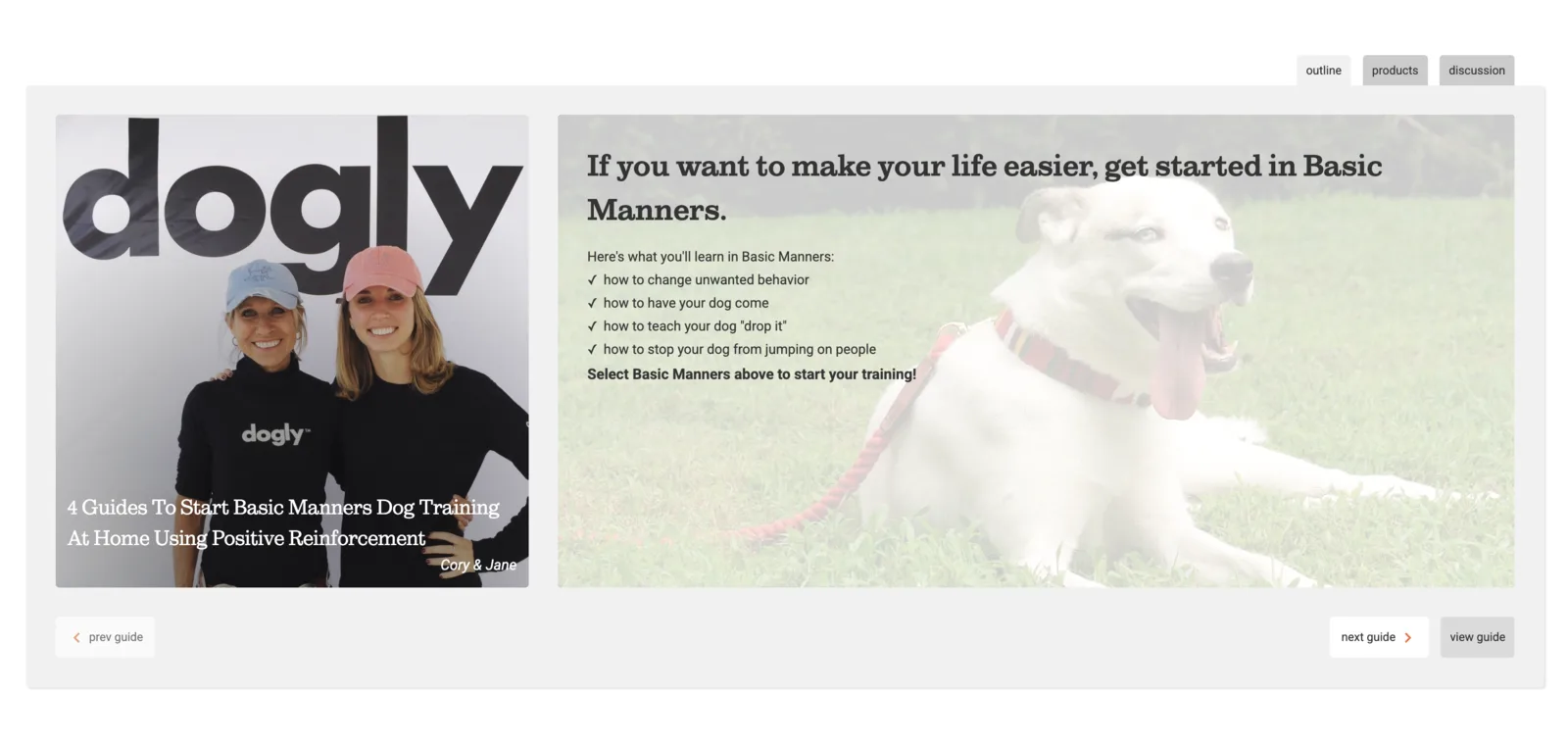
The guide experience brought media, instruction, navigation, and topic discovery into a repeatable learning structure.
Era Three: Onboarding and Daily Guidance
The recent onboarding and /my-dogly/today agenda moved the product from browsing into guided action.
Onboarding used a conversational flow, progressive questions, category and topic selection, carefully timed content, and responsive layouts that protected focus on smaller screens. The agenda reused that language for daily tasks, notes, help, progress, recap, and subscription gating.
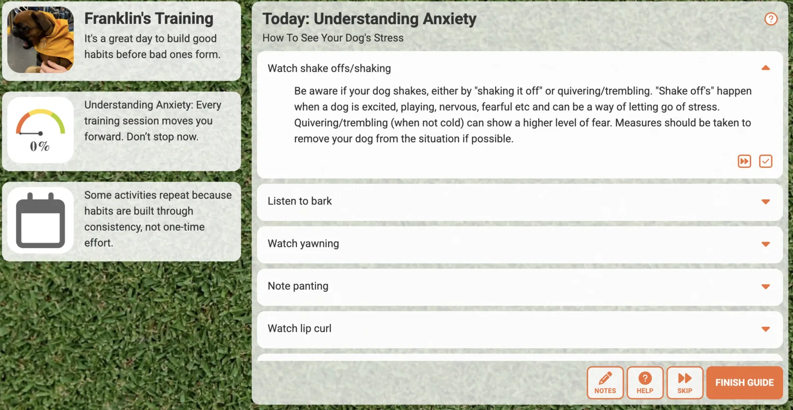
Daily guidance translated a broad content library into a specific task, with progress and support kept in the same working context.
These screens required more than desktop and mobile styles. Tablet widths often created their own composition problems: a dog image that supported the experience on desktop could crowd the conversation at 700 pixels; a control that fit on mobile and desktop could wrap awkwardly between them.
I introduced and centralized breakpoints around the actual behavior of components. For highly specific interactions, an additional breakpoint was preferable to forcing a generic two-layout rule onto a screen where it did not work.
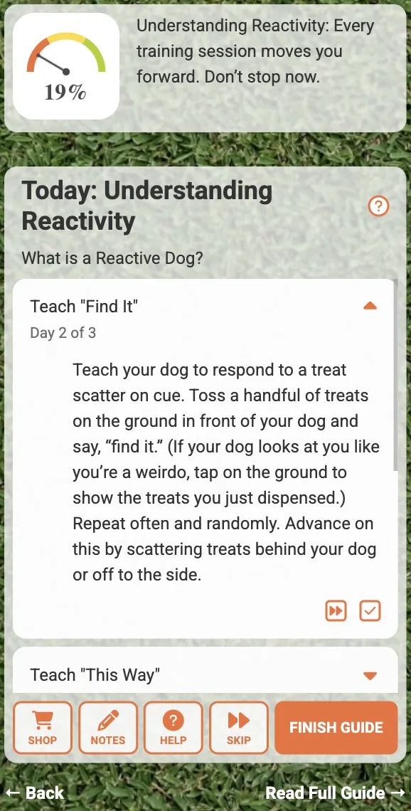
The mobile layout preserved the task, progress, and completion path instead of merely shrinking the desktop composition.
Era Four: The Homepage as a System
The 2026 homepage is the strongest expression of the current direction.
It is not one static homepage. Visitors, registered users, and members see different versions based on what Dogly can help them do next. The design covers concerns capture, product explanation, plan comparison, testimonials, channels, founder story, daily plans, chat, recipes, videos, products, and a personalized library.
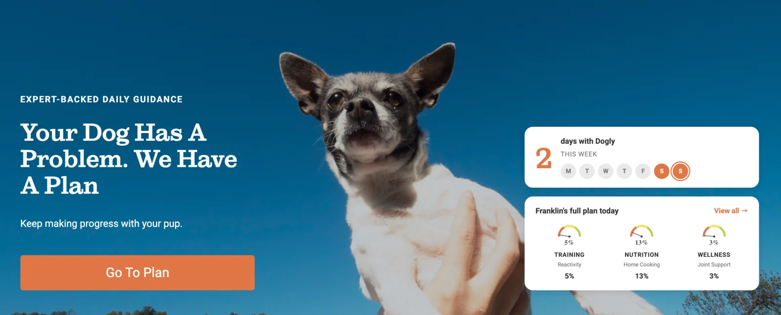
For a member, the homepage becomes a return surface: current progress and the next useful action replace a generic acquisition message.
I designed the homepage in Figma across desktop, tablet, and mobile, then built the supporting Rails architecture, responsive components, and focused Stimulus interactions.
The implementation turned repeated visual choices into shared primitives:
- Eyebrow labels and typographic hierarchy.
- Primary and secondary button treatments.
- Category-aware cards and overlays.
- Scrollable carousels with shared behavior.
- Pricing and comparison patterns.
- Tags, pills, status badges, modals, and loading states.
- Centralized breakpoint tokens.
- Configurable copy and imagery that retained the intended design structure.
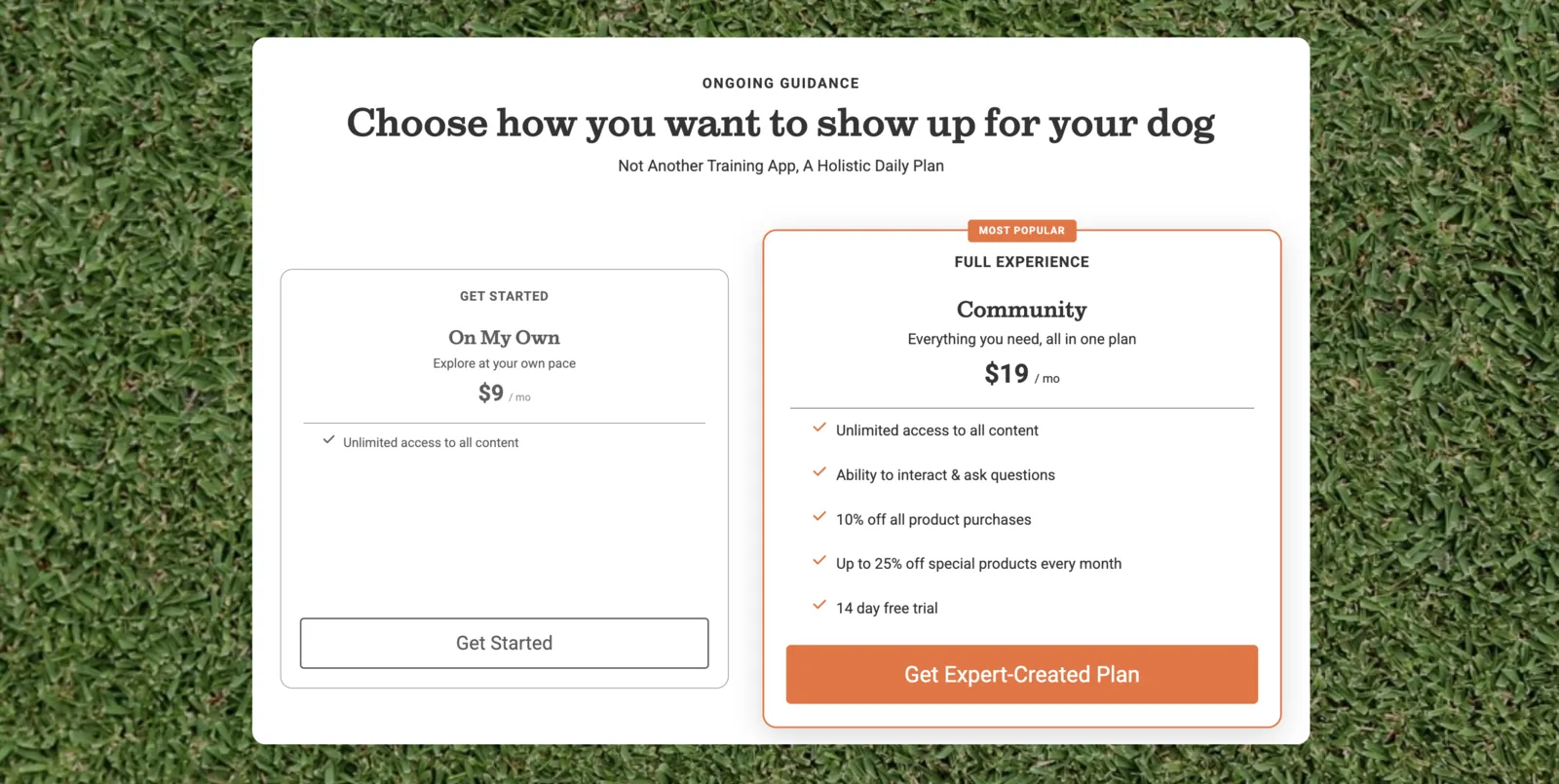
Pricing and plan differences became part of the same visual system rather than a disconnected checkout decision.
The design also had to account for empty libraries, missing follows, multiple dogs, incomplete onboarding, subscription state, long names, and member-specific actions. A polished default screenshot was only one state among many.
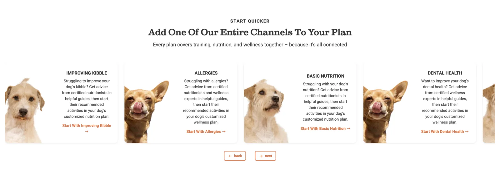
Visitor sections moved from broad product explanation toward recognizable problems and clear entry points.
Balancing Imagery and Performance
Keeping imagery did not mean ignoring performance.
I tracked performance experiments across the homepage, Advocate profiles, Channels, daily plans, posts, products, shelters, and shop pages. The test matrix compared asset-delivery strategies, navigation changes, server configuration, and page-specific revisions using first and largest contentful paint, time to interactive, total blocking time, layout shift, bundle size, and Lighthouse score.
The results resisted a single optimization story. A change could improve paint timing on one route while increasing main-thread work or layout instability on another. The homepage work therefore also tested CDN transformations, responsive sizing, preload and preconnect behavior, font loading, and which image the browser recognized as the largest contentful paint candidate.
Some optimizations improved lab results but behaved poorly in the real page. Others reduced rendering cost without changing what users valued. The design and engineering process treated performance as one part of the experience rather than a score pursued independently of it.
Working Through Legacy Constraints
Bootstrap was one of the most persistent constraints. Dogly inherited an old, partially customized beta-era implementation whose assumptions leaked across forms, grids, buttons, and responsive behavior.
React components, Haml templates, legacy JavaScript, and years of page-specific SCSS added other layers. A visual change could look correct on one route while an old selector quietly changed another.
I gradually moved new work toward explicit Dogly components and design tokens, removed dead selectors, centralized breakpoints, and replaced broad framework behavior where it created more uncertainty than value.
This was incremental by necessity. The shop and brand pages still retain more of the legacy language and are still candidates for the next modernization phase.
Building Trust Through Design
Early in my tenure, part of the work was earning founder trust in design decisions.
I did that by connecting visual proposals to user behavior and product outcomes, bringing concrete designs rather than abstract criticism, and responding carefully to feedback. Over time, the review dynamic changed. By the later phases, I was usually bringing designs that needed only small refinements before approval.
That trust does not mean designing alone. It means the founders understand the reasoning, know that the work reflects Dogly's identity, and can focus feedback on the product decision rather than policing every visual detail.
Outcome
Dogly now has a recognizable product language spanning its newest homepage, onboarding, agenda, authentication, pricing, cart, partner onboarding, and discovery work.
The system preserves the image-led quality users value while making interaction color, content hierarchy, responsive behavior, loading state, and reusable layouts more consistent.
The work also changed how new features are built. Design is no longer a finishing pass over whatever markup exists. User-facing initiatives move from a shared north star into responsive design, then into a technical plan that accounts for states, content, performance, and implementation boundaries together.
What I'd Improve Today
I would create a small, documented component gallery backed by the actual Rails partials and Stimulus controllers. The product has a growing shared system, but its rules are still easier to discover in shipped pages than in one reference surface.
I would modernize the Advocate profile, shop, and brand pages next. They represent important customer journeys and contain the clearest remaining visual drift from the current system.
I would also formalize image art direction: target aspect ratios, focal-point metadata, overlay guidance, responsive transformations, and performance budgets by component. That would preserve the emotional role of imagery while making its delivery more predictable.